Abstract
E-Link is a desktop based maintenance tool to manage elevators. Service staff can control the elevator and run several diagnostics with the tool.
The challenge was to make a complex UI tool understandable, without compromising the power users' efficiency. The main task for me was to redesign the service from an outdated 90s application to match the modern KONE look and feel. Heavy technical restrictions needed to be applied throughout the re-designing process. We wanted to give a fresh thought on the features of this applications and remove the clutter and make the navigation on the tools simple for the user to use.
There were 3 different tools that were to be re-designed under E-link (Elevator monitoring tool, Reporting tool and a playback tool).
Elevator monitoring tool
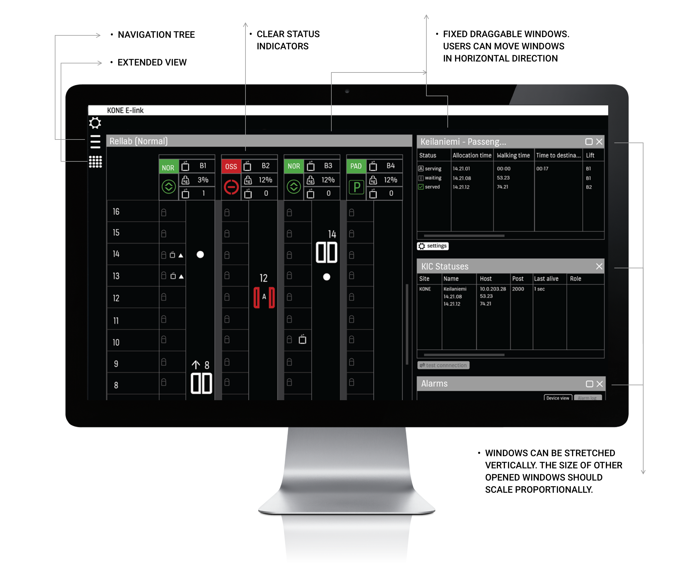
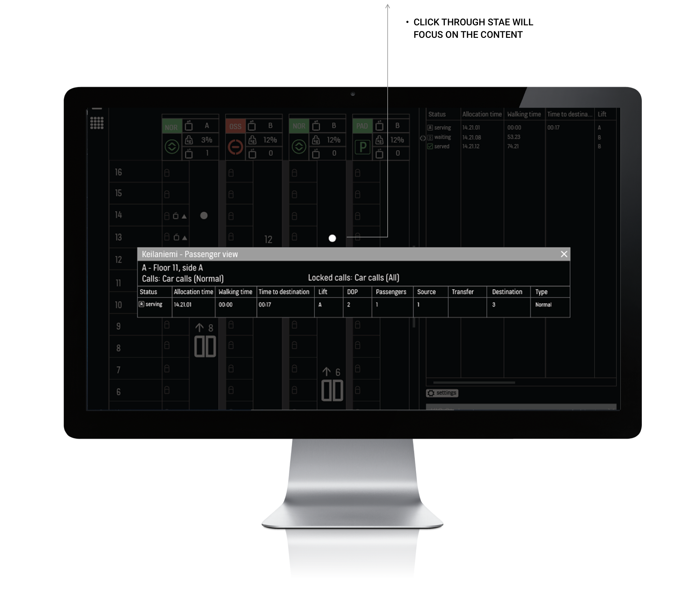
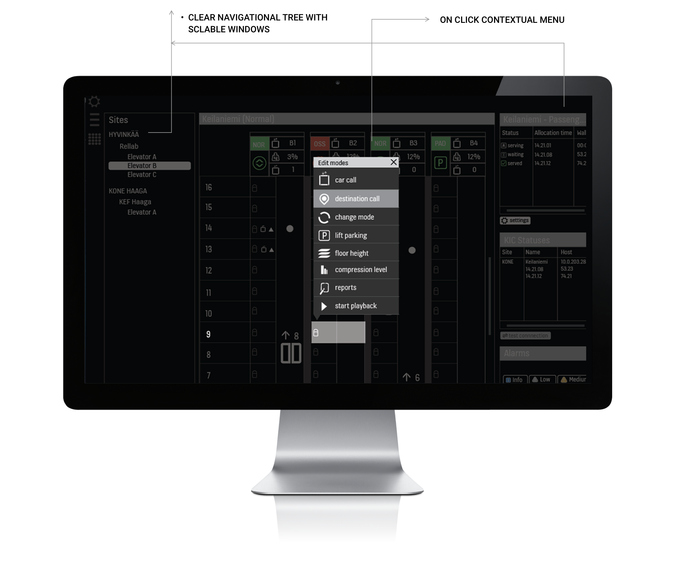
This tool was used for monitoring live elevator traffic. The maintenance staff could see the current status of the elevators, possible alerts and warnings through the system.
Playback tool
This tool helped the technicians to record actions of the elevator by selecting the exact time and date. The recorded files were then saved and played back to detect exacts faults in the elevator at a give time.
Reporting tool
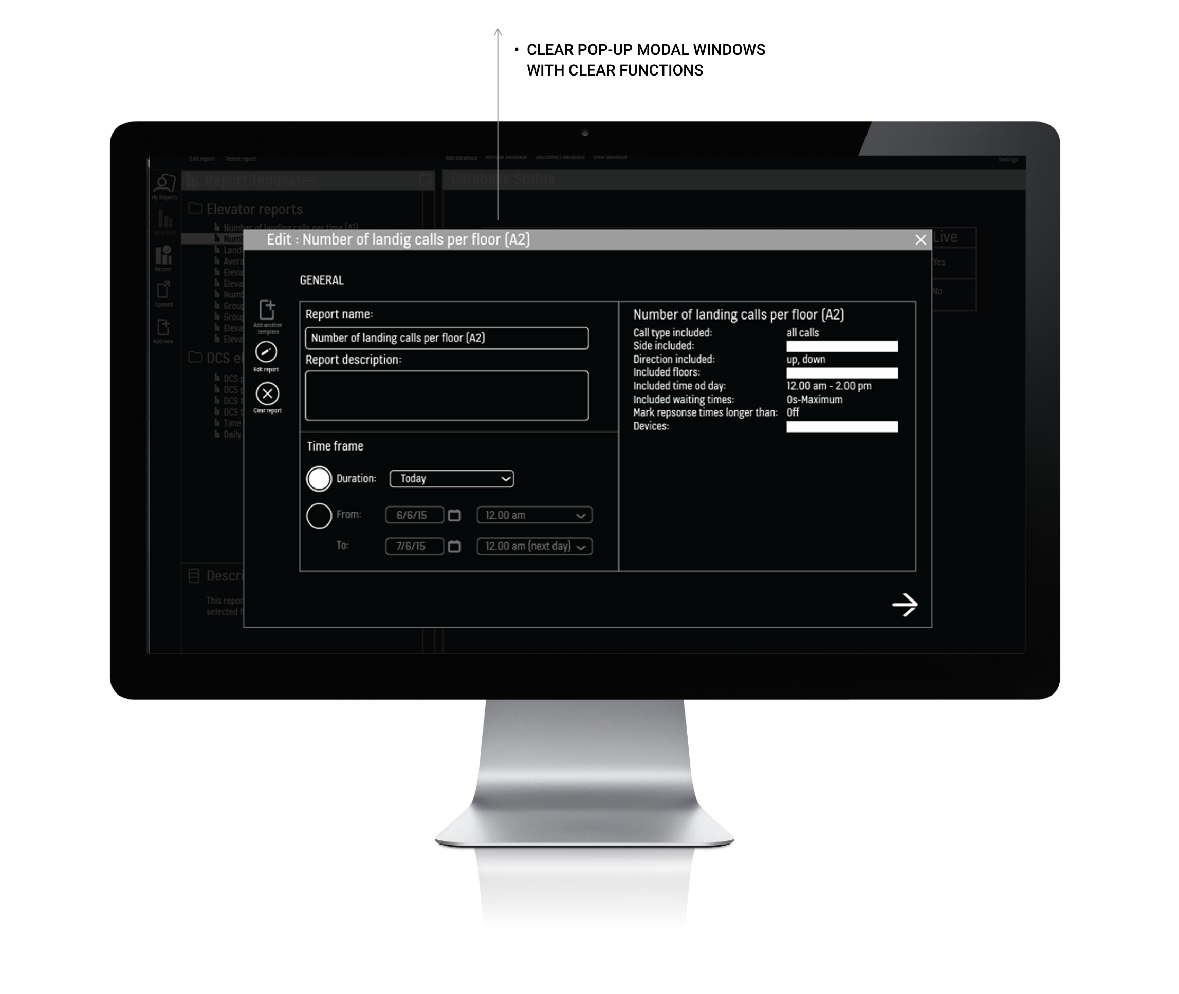
This tool was used to create multiple reports on an existing faults in the elevator and were later on used to either fix the issues or report them for further analyses.
We found out that the most important tool used by the users was the elevator monitoring tool. We wanted to continue supporting the other two tools too, and therefore we re-designed all the tools, but kept our main focus on the ‘Elevator monitoring tool’.
Case study below showcases only the ‘Elevator Monitoring Tool’.
My responsibilities
Visual designer
Creating graphics assets, icon design, designing user interfaces and pixel-perfect UIs.UX designer
Prototyping, wireframes, concept designThe elevator monitoring tool - design process
I conducted a bi-weekly survey with the technicians to understand the necessary features used by them.
I reviewed the initial designs with them to make sure the features were designed to their needs and expectations.
Together we brainstorm on improving the functions of the tools.
I made the interactions more streamlined and simplified the complex UI.
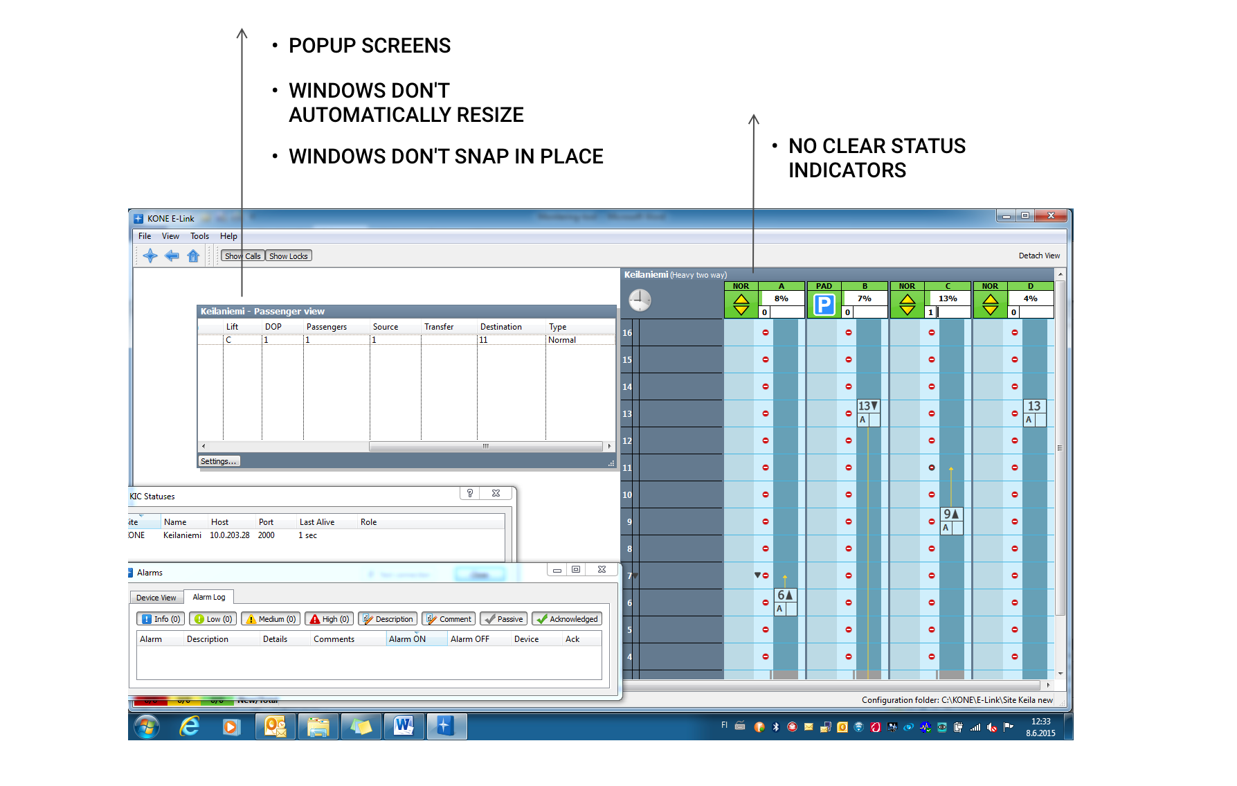
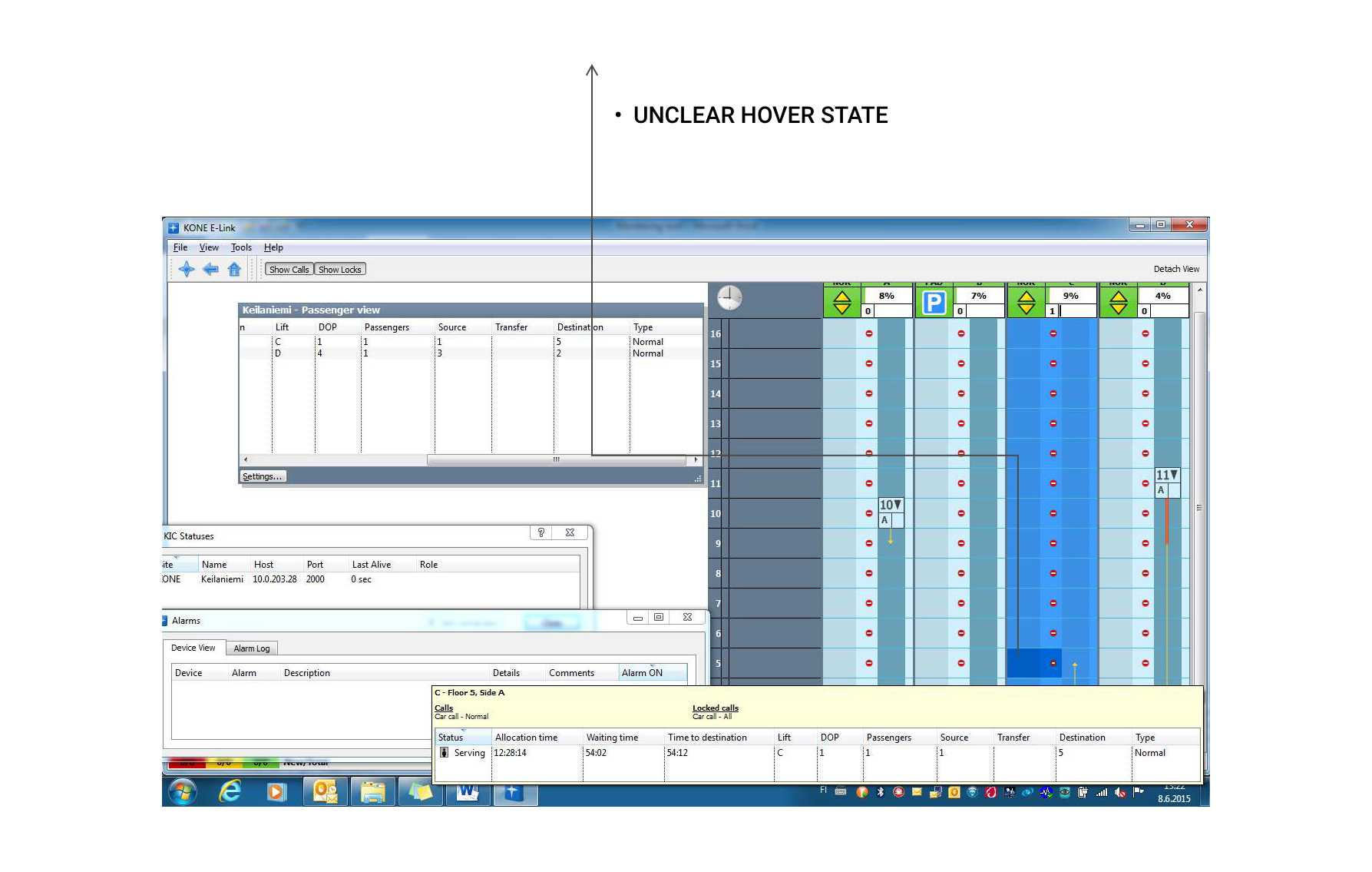
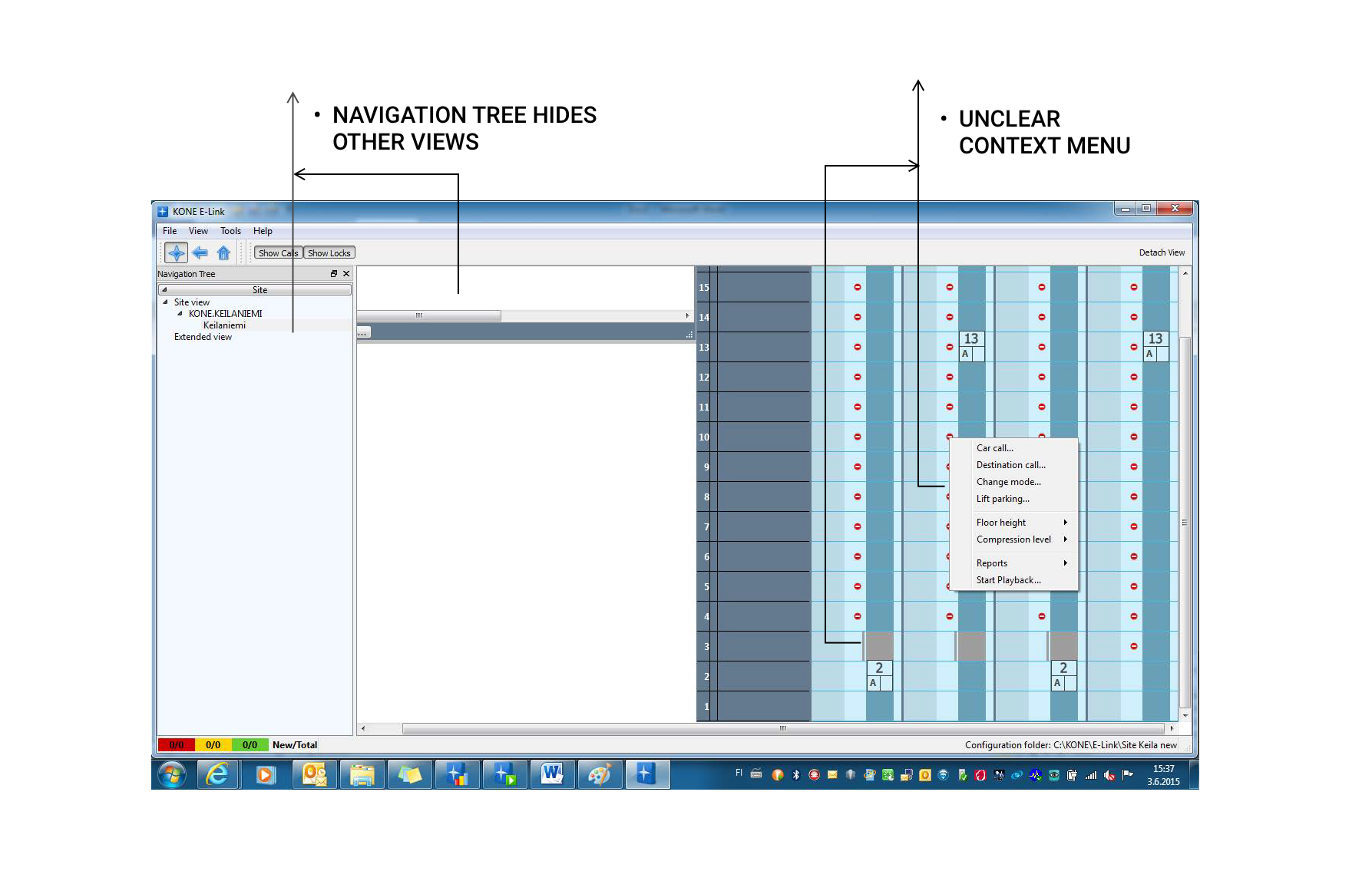
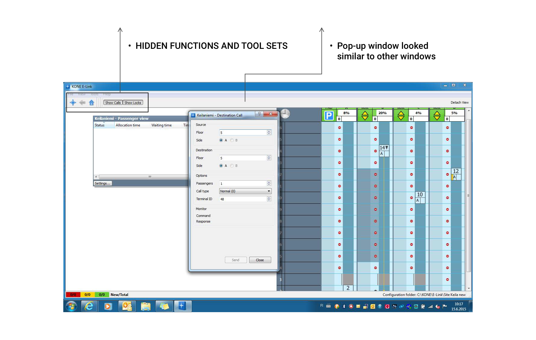
Old designs
The new design
Usability evaluation
The initial user test with the prototypes showed that users found it difficult to find information on a black background. The applications were heavy on text and they needed a lighter background to conduct focused actions on the tools.
I did another iterations of the designs on all screens with white background.
We did another round of user testing with the prototypes, this time using a white background. This worked very well with the users. We had to make a design decision to keep this tool as an exception on the KONE black and white style guides.
The designs were iterated and modified further based on the user tests and reviews with the team.
Revised designs - white background
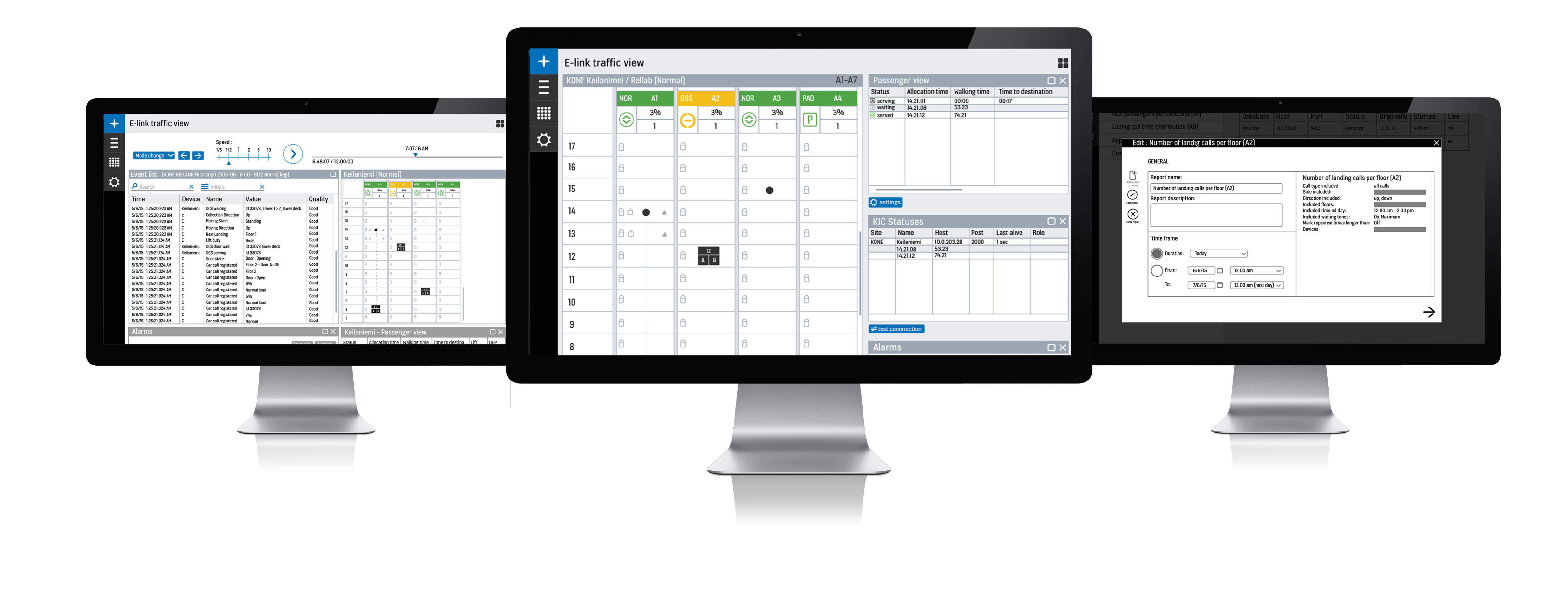
The product was finally released and a few screens can be seen on KONE website