Visual design & styleguide for CarsDirect
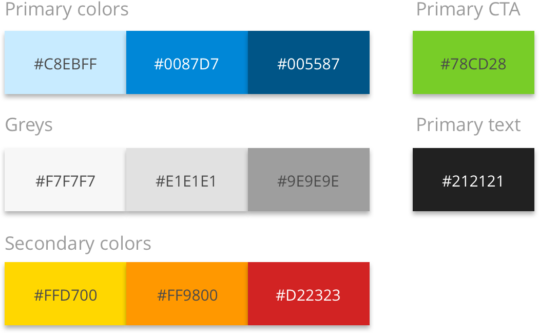
Colors
The color palette was updated with fresh new colors to give the site a more modern feel. The new palette roughly follows the old brand guidelines to maintain the brand identity.
Icons
I wanted to introduce a new set of icons to match the visual language. After thorough research we ended up using Ionicons due to the large icon base and modern, consistent look and feel.
In addition to the out-of-the shelf icon set, we designed a set of custom icons to support the specific use cases CarsDirect had. Examples of the custom icons are the different car styles on the left.
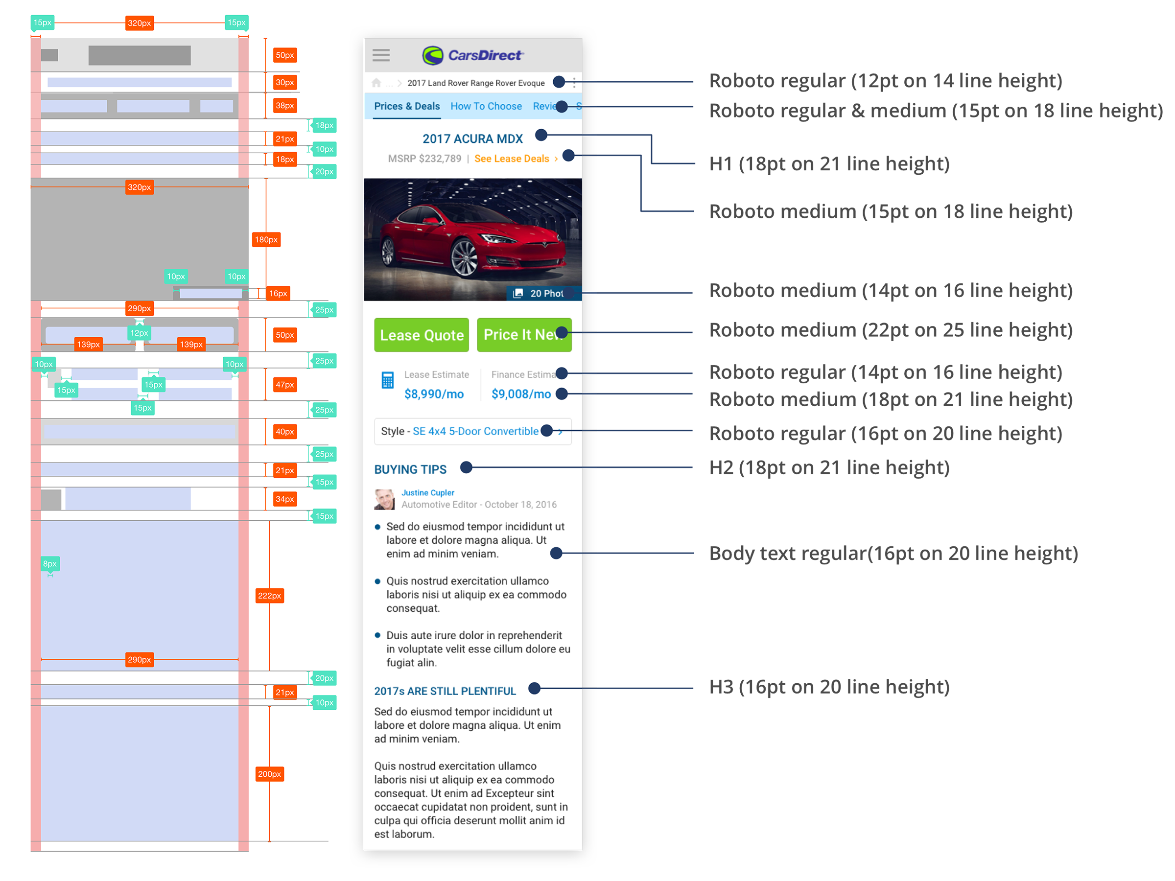
Layout & text hierarchy
I wanted to bring in a new font to get better visual hirerachy on text. CarsDirect is a text heavy site and needed a font with multiple weights. I chose Roboto as a replacement to Helvetica.
Buttons & Interaction
A goal in the redesign was to harmonize and simplify the CTAs and secondary action buttons. I designed a limited set of buttons with clear color distinctions.
CTAs
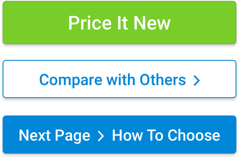
Action buttons
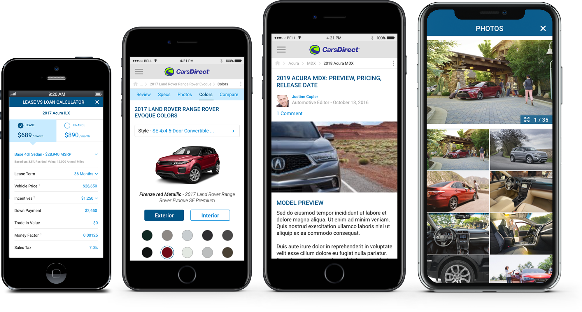
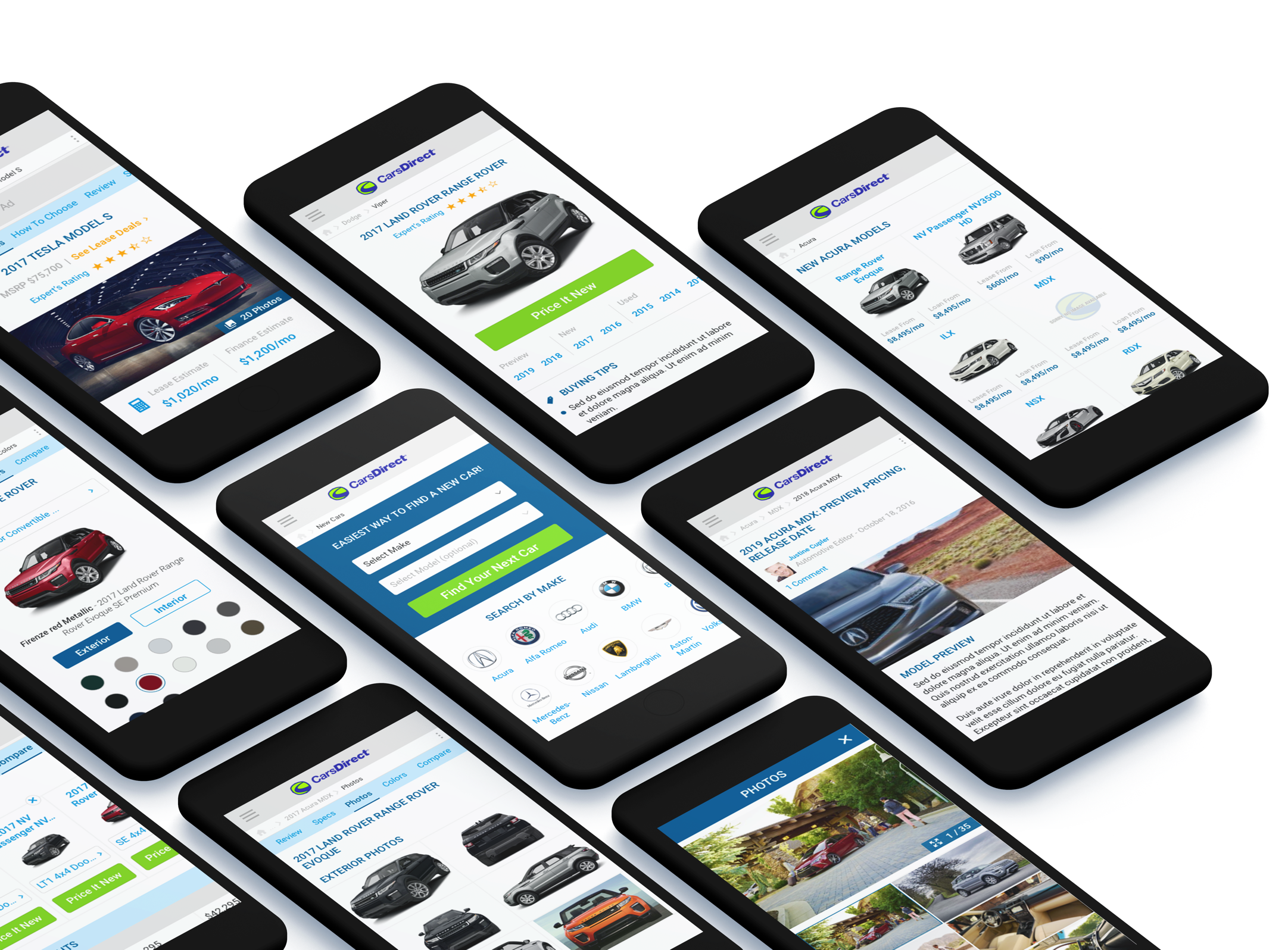
Designed for different form factors with reusable components
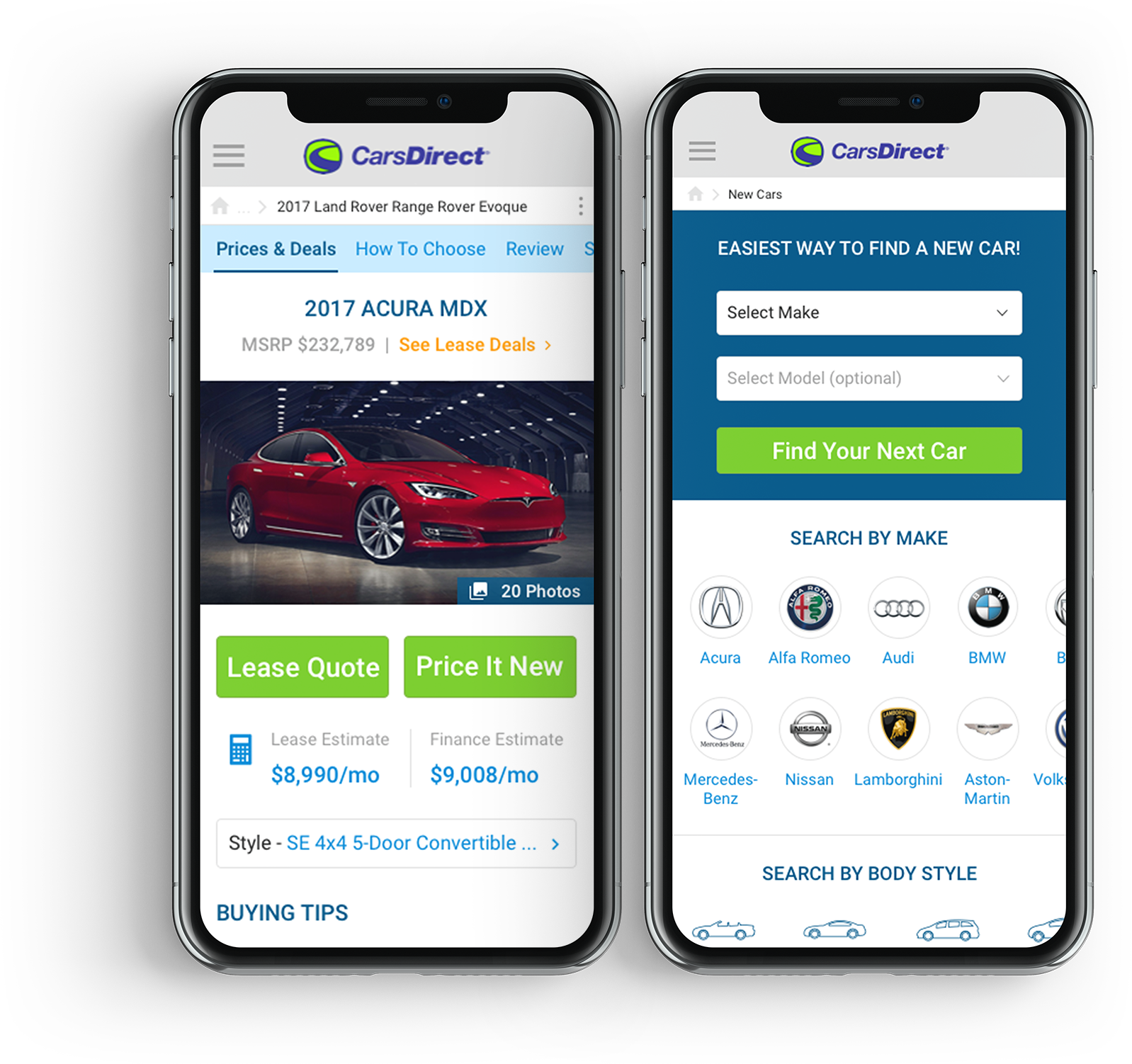
On CarsDirect the users have multiple entry points to vehicel information. This means many of the pages reuse same components in a different composition. For example, used and new car pages look mostly the same, but users need partially different information to make their decision. This is why I designed the pages with reusable UI components. This way it is easy to compose the dynamic content to page variants with similar look and feel.
Majority of CarsDirect users were older generation iPhone users at the time of redesign. This is why we had to make sure the site works well with different form factors.