Abstract
I worked at Internet Brands as a Sr. Interaction Designer. My role involved UX and UI design, responsive web layouts and building the overall visual language for the automotive e-commerce sites. My responsobilities included qualitative and quantitative user research on our products.
My main project was CarsDirect re-design. CarsDirect is a research site for new and used vehicles. Users come to the site to find relevant information for their next vehicle. For us SEO (search engine optimization) plays a big role in how people find our site.
Apart from CarsDirect, I also worked on several other automotive eCommerce sites such as The Car Connection, Motor Authority, and Autos.com.

My responsibilities
UX & interaction designer
Leading the redesign effort. Conducting usability studies, analyzing user behavior through usage heat-maps, building interactive prototypes, defining use cases and creating wireframesVisual designer
Creating graphics assets, icon design, designing mobile and web interfaces and pixel-perfect visuals.Design process
|
|
|
|
|
Case study: CarsDirect mobile re-design - new car buying path
CarsDirect mobile site needed an update and content reorganization. The project aimed to increase the conversion rates through our lead form submissions. We noticed a significant increase in the number of users landing on our site, but they weren’t converting through submissions. This made our partnered dealership worried, especially when it came to buying new cars.
The goal was to simplify the path for the users and to provide valuable information on our site. Here are some of the challenges that the old site faced:
Customers got lost in the navigation
The path to conversion had to be streamlined with focus on most relevant content
Customers could not find the information they needed
Clear calls to action were required and the information architecture had to be retaught
Old look and feel
The design needed ground up thinking, mobile first
Desktop and mobile out of sync
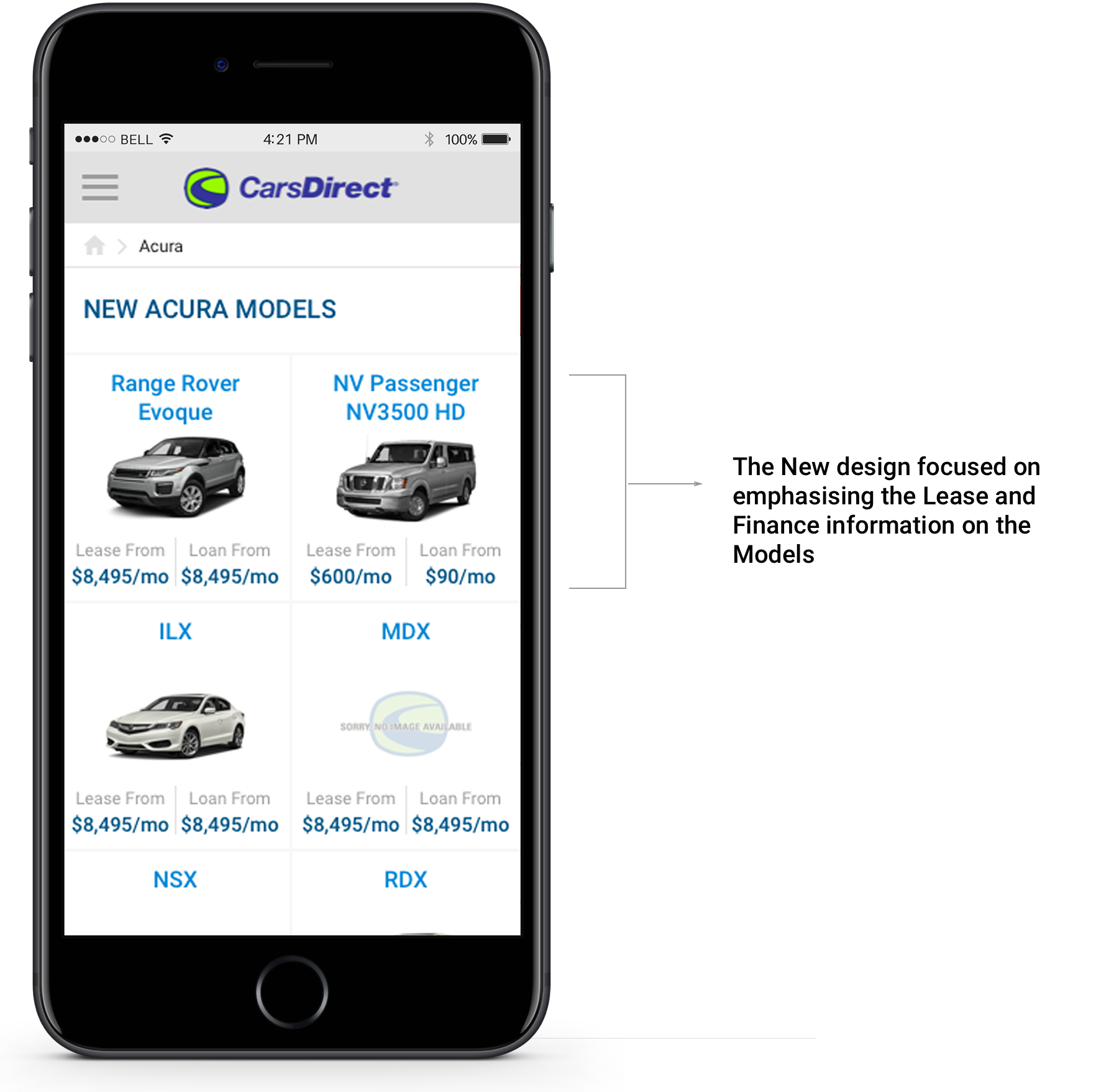
Common style guide was created for desktop and mobile. Missing content was brought to mobile from desktop.
Poor ad impressions
New strategies were designed for higher click-through rates and visibility
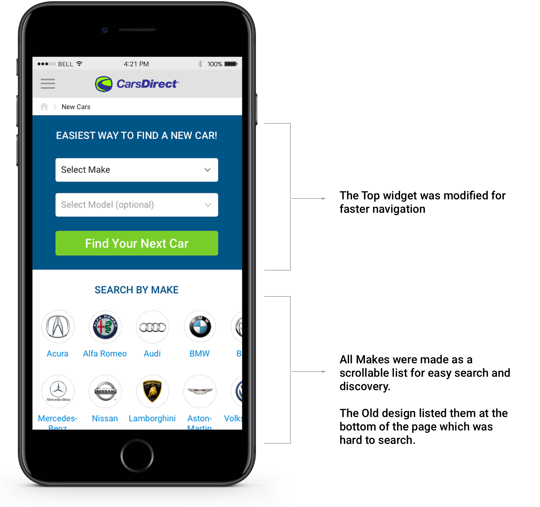
The old user flow
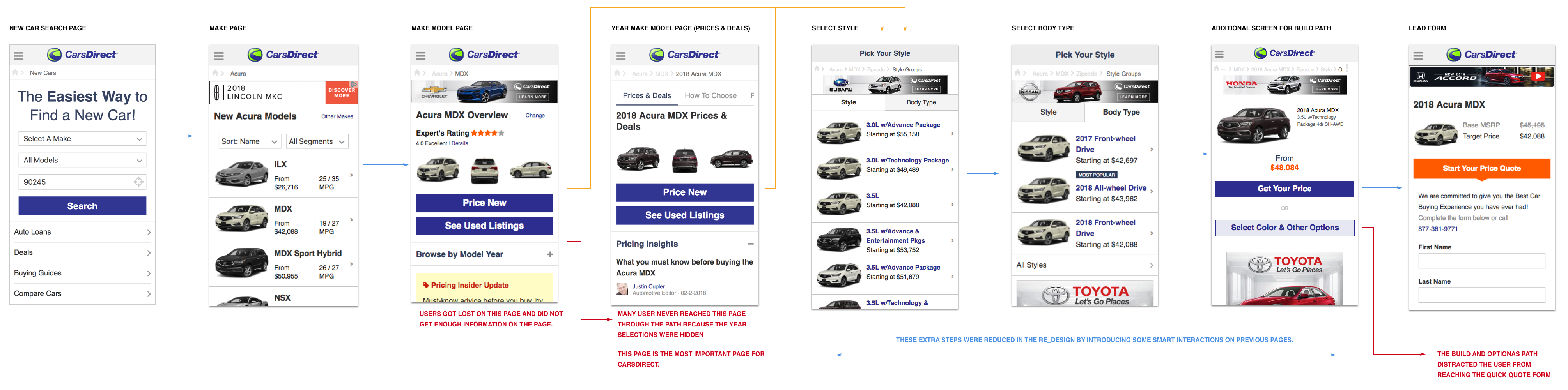
The old path: users were unable to find the content they were looking for and conversions were low.
Usability studies
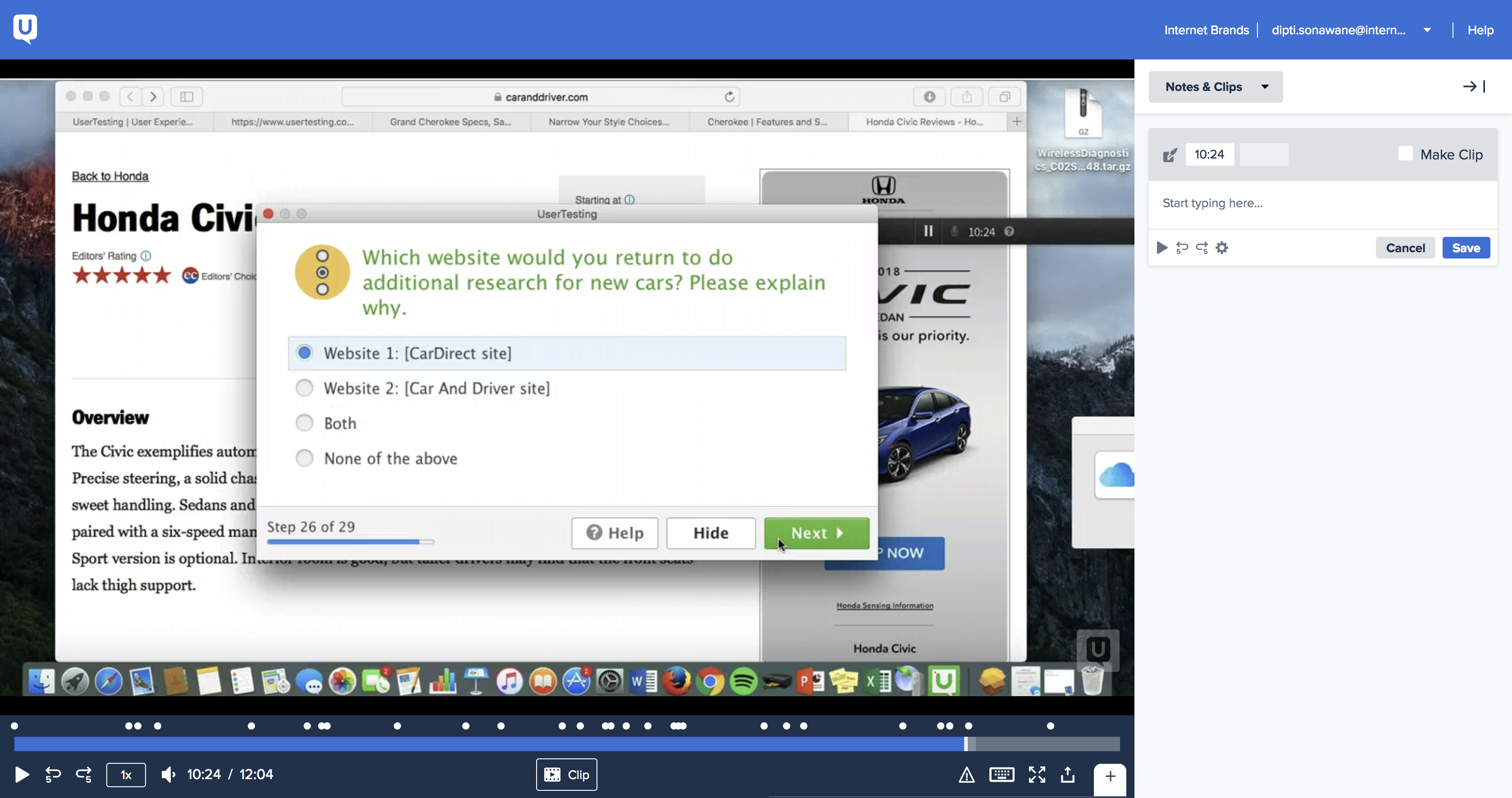
I conducted several usability tests to understand how users navigate and perceive the CarsDirect website. I did comparative study by benchmarking competitors' websites and also did a survey with real users.
I used several tools such as Usertesting.com (online survey and tasks), Hotjar (recordings, polls and heatmaps) and Invision (to test click through prototypes). The findings were presented to the stakeholders with suggestions to improve our existing desktop and mobile experience. These results were compared against quantitative data gathered using google analytics and internal testing tools.
Overall, we found out that we need to simplify our mobile and desktop experience and make it modern looking for our users to better engage with our product. There were many big and small decisions that were fine-tuned along the process based on the findings.
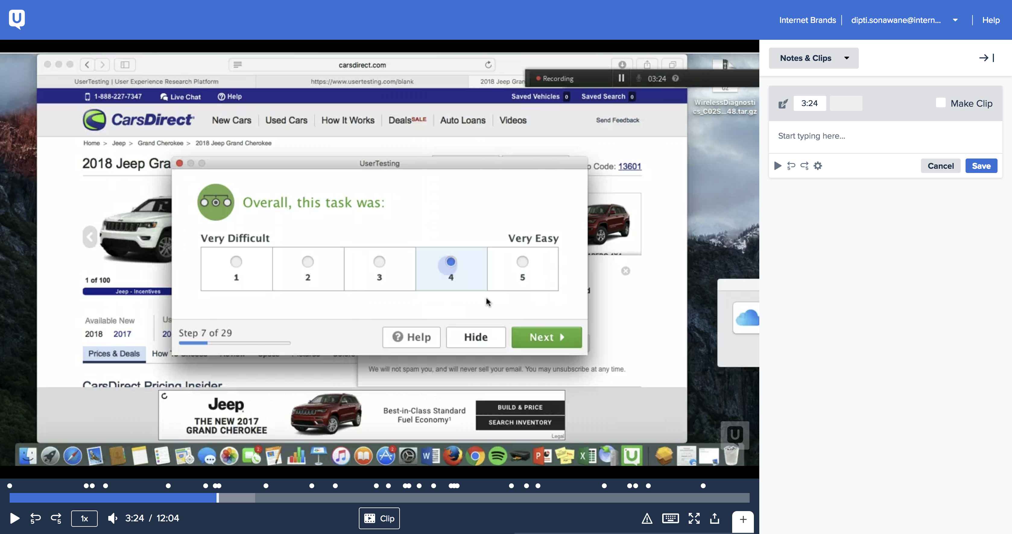
Conducted comparative study between CarsDirect and competitor sites using Usertesting.com
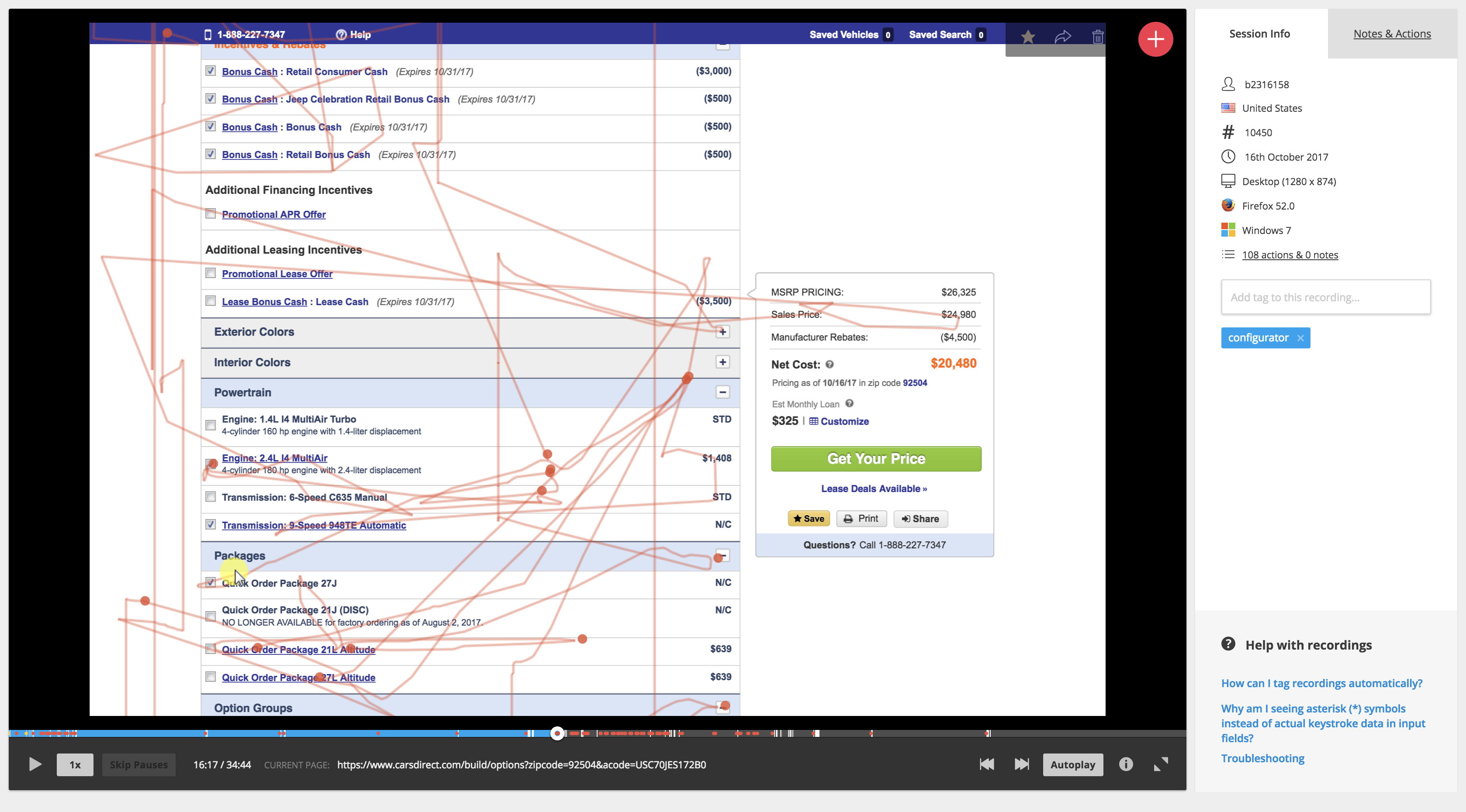
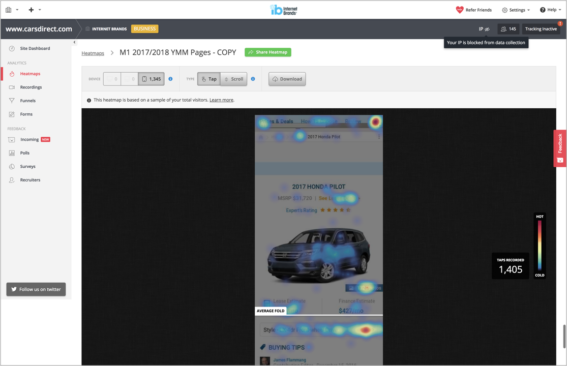
Analyzed over 90 recordings on Hotjar. This was to test the user behavior on the old site across multiple pages.
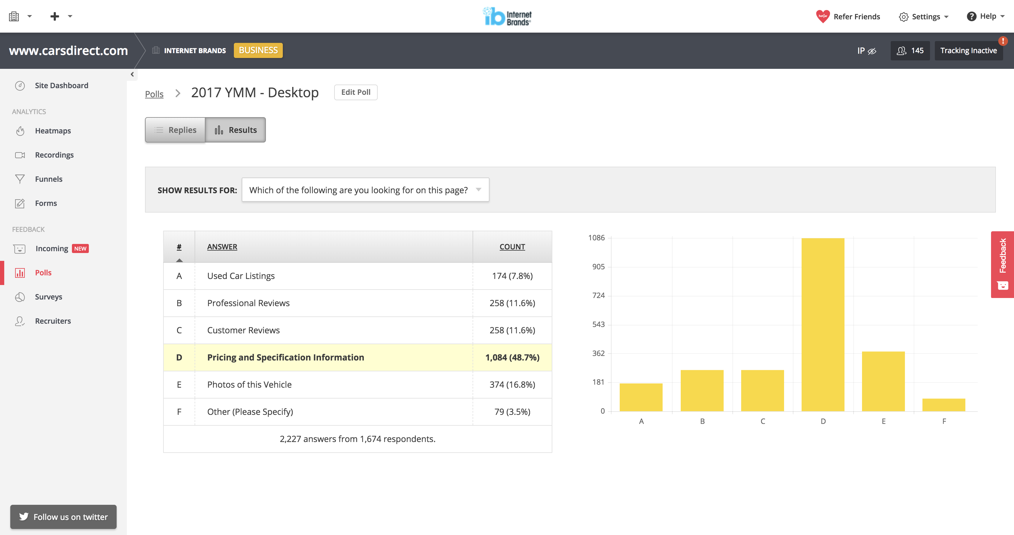
Hotjar polls were used to understand what users were looking for.
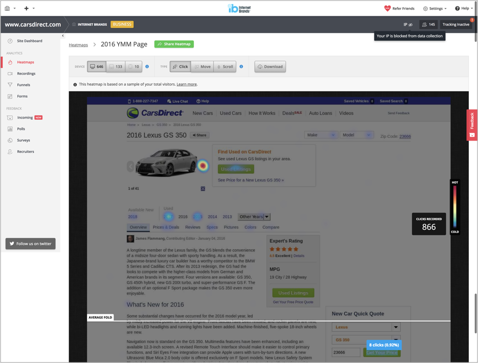
Heatmaps and polls were set up to gather more insights.
Hotjar showed more engament from the users.
The redesigned mobile site shows significant increase in clicks on several key metrics.
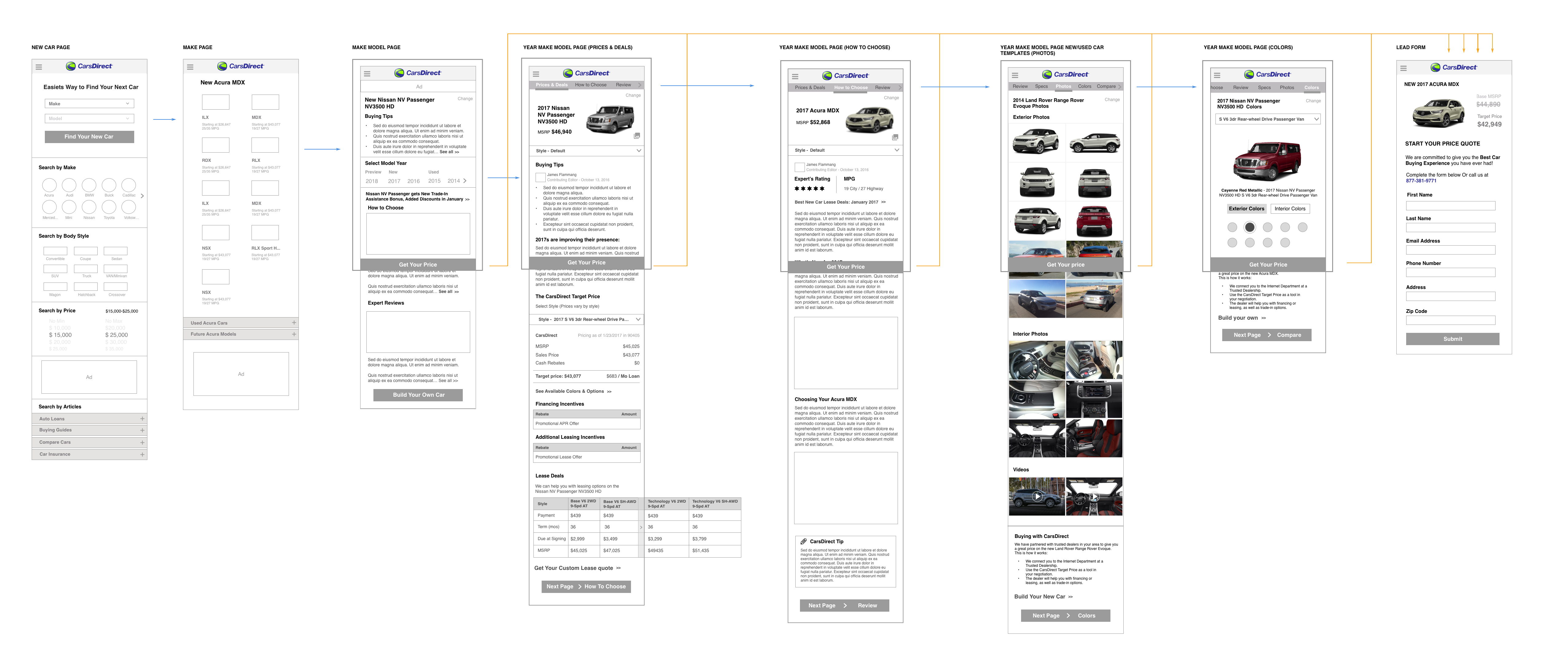
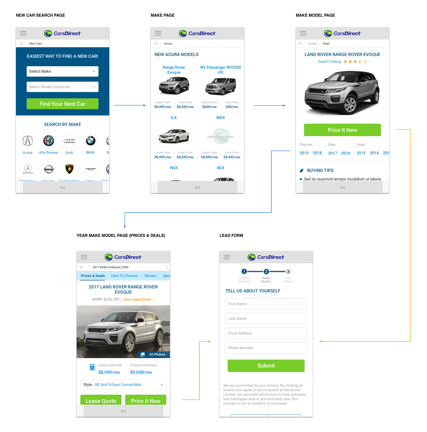
Wireframes
After gathering insights through research, the next step was to create low-high fidelity wireframes. Below is the main navigation flow of the new car buy path.
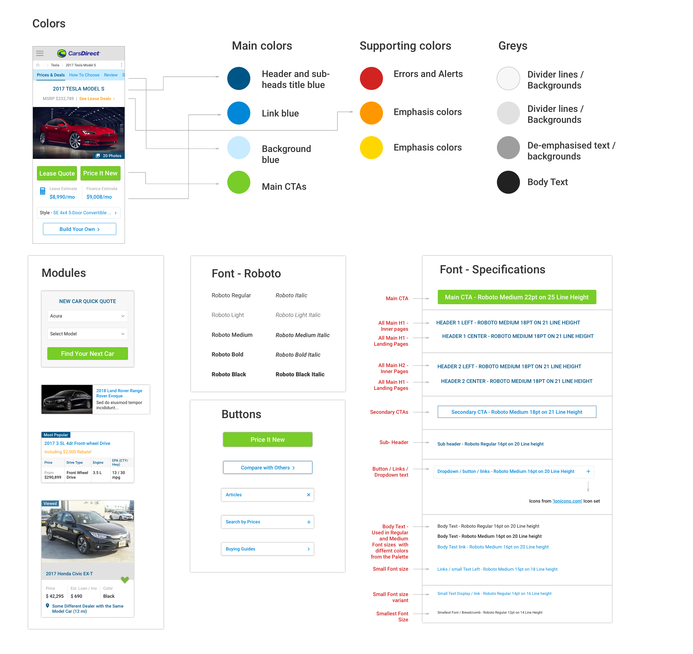
Styleguide: fonts, styles & colors
I initiated the idea of making the mobile and desktop look and feel consistent. The styles and the colors were up-lifted based on the existing color palette. The font was changed together with the icon set. The styleguide is made of modules to allow reusable components. The new styleguide will be followed on desktop and mobile.
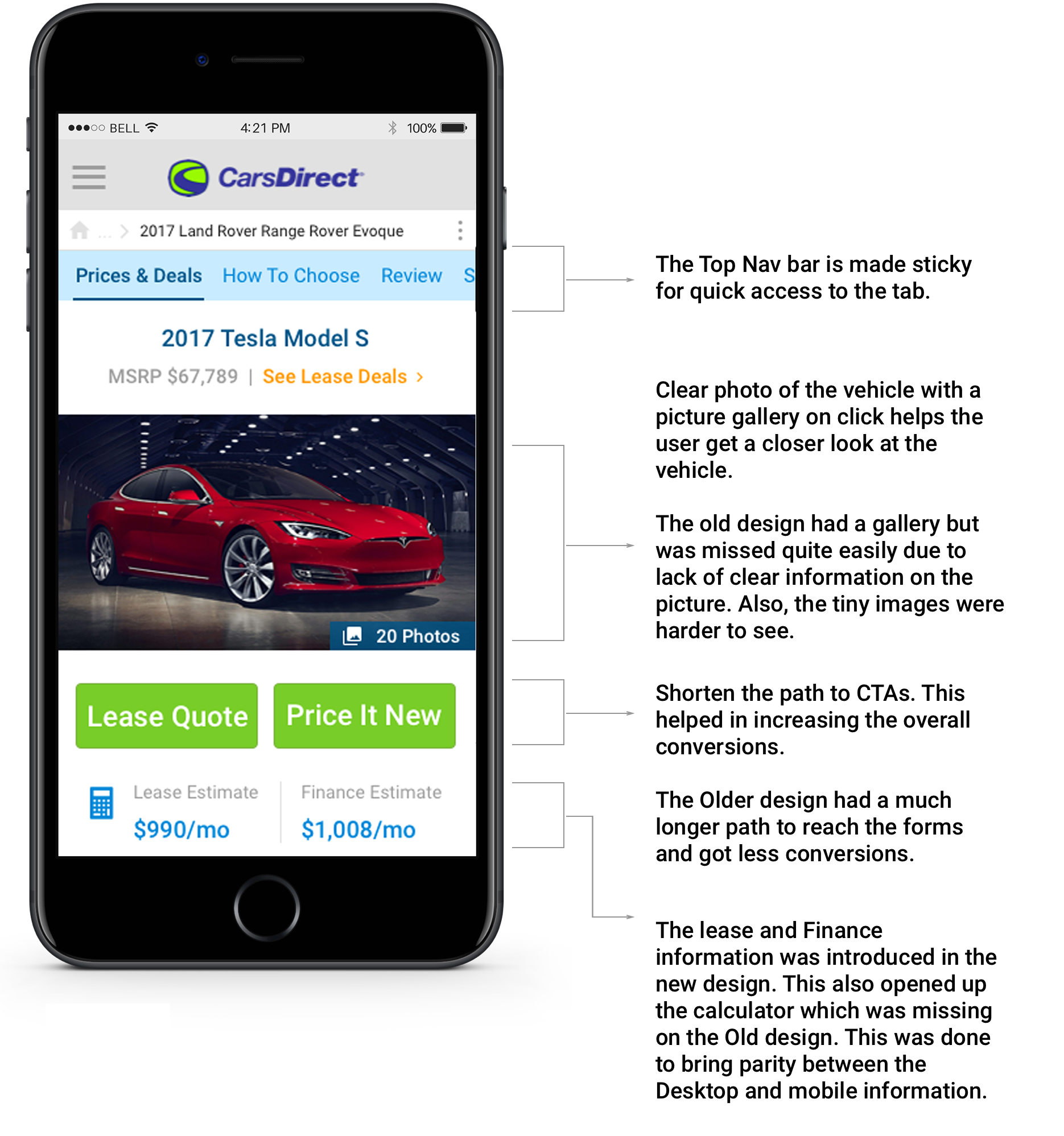
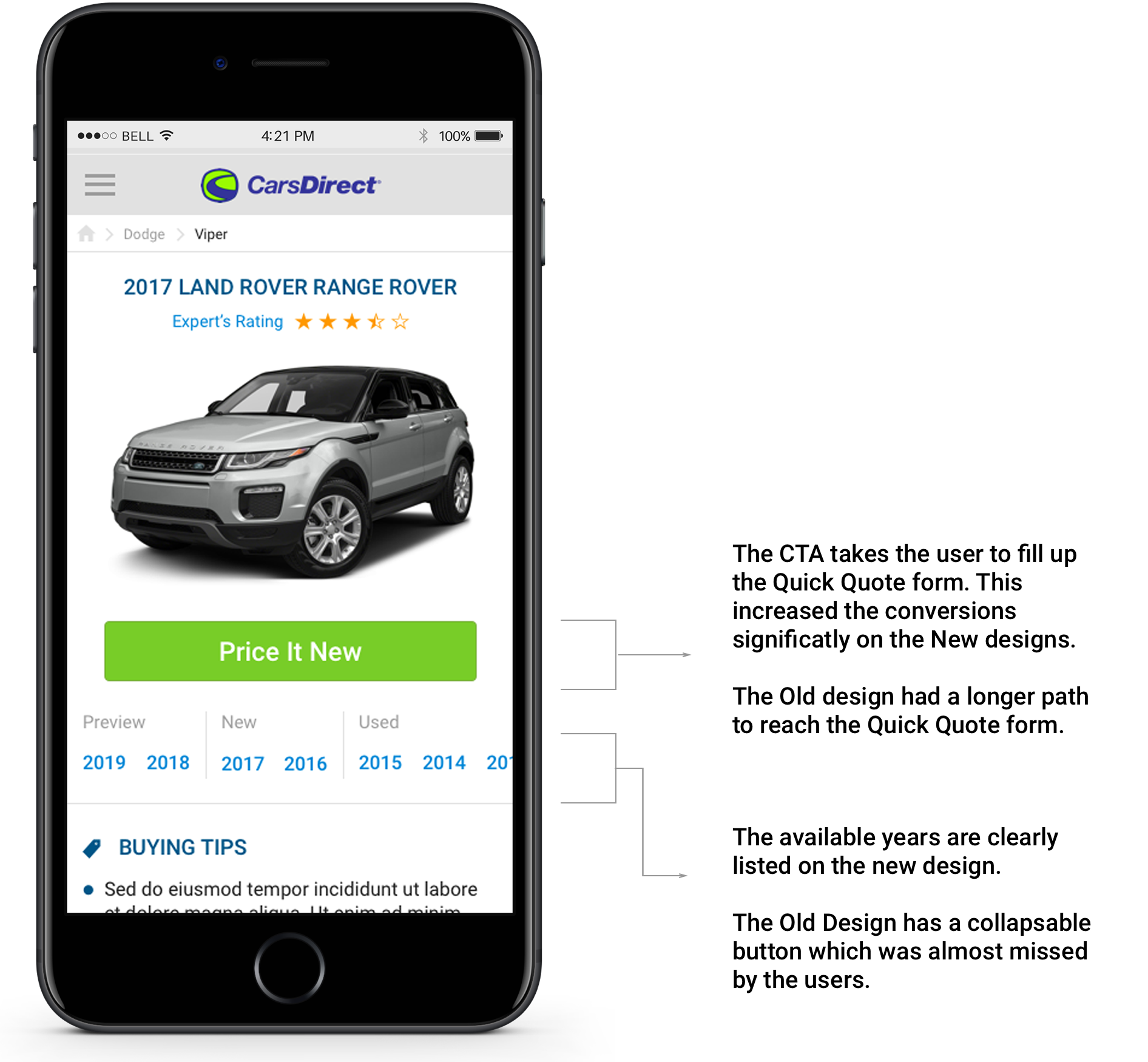
The new user flow
The re-designed path has clear emphasis on the relevant content and CTAs. Users were able to navigate easily through the path. We saw a significant increase in conversion rate and also the ad impressions doubled on the new designs.
Prototypes
To collaborate effectively with the development and business teams, I created a number of prototypes. This was to demonstrate the micro interactions and transitions between elements which otherwise would have been difficult to convey.
Prototype to demonstrate the navigation in photo gallery.
New car buy path prototype
Results & final designs
The final designs were A/B tested against the original version. The new heatmaps showed that users interacted more with the content of the site and were able to get best prices from the dealers.