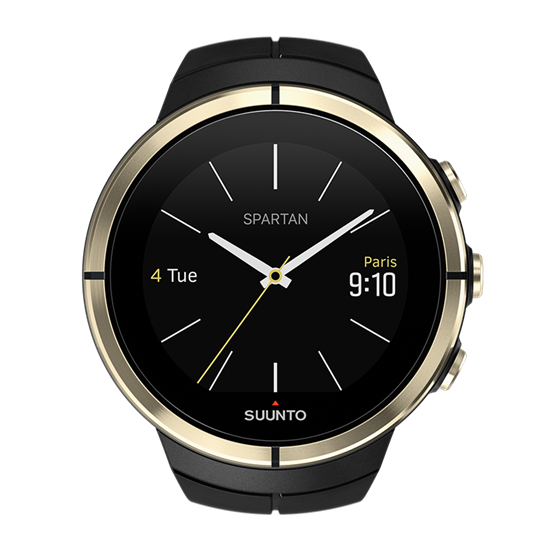
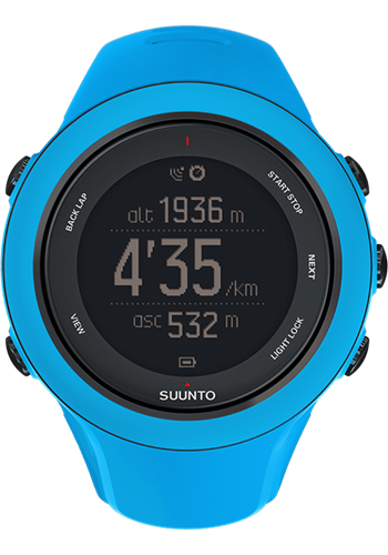
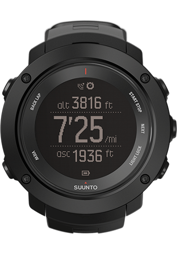
Suunto Spartan - designed from the ground up
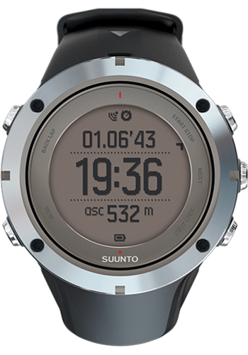
Suunto Spartan watch design was my main project at Suunto. It was a new smart watch for professional athletes and outdoors enthusiasts alike. Spartan is Suunto's imaginination on how their sports and outdoors watches - the Ambit product family - would look like with a modern operating system and technology.
My responsibilities
Visual designer
Creating graphics assets, icon design, designing watch interfaces and pixel-perfect design visuals.Interaction designer
Building interactive prototypes for the touch interface, defining use cases and creating wireframesUX designer
Conducting usability studies, planning and gathering feedback through workshops and online surveysCase study: watch interface design
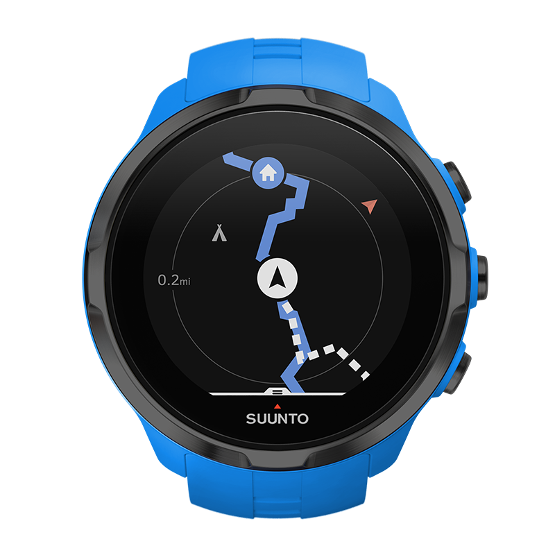
When it comes to design, the Spartan was developed from ground up. It had new hardware, operating system and display technology. Ambit watch series had always targeted for a niche audience: there was a watch for outdoors, a watch for sports, one for mountaineering etc. Spartan was the first watch to combine all in one. For the first time Suunto designed a one-fits-all sports watch with a touch screen.
Put together there were a lot of design challenges when designing the Spartan Ultra watch:
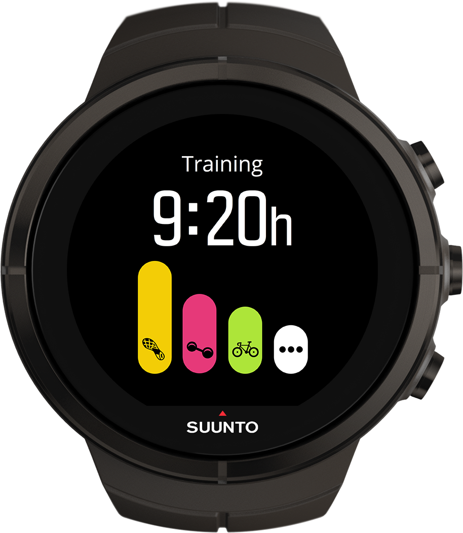
One watch for everyone: over 90 sports modes in one tiny interface
Need to design template based interfaces that would fit the small screen
Touch screen with physical buttons
Need for logical and meaningful interactions for users to be able to quickly switch between screens.
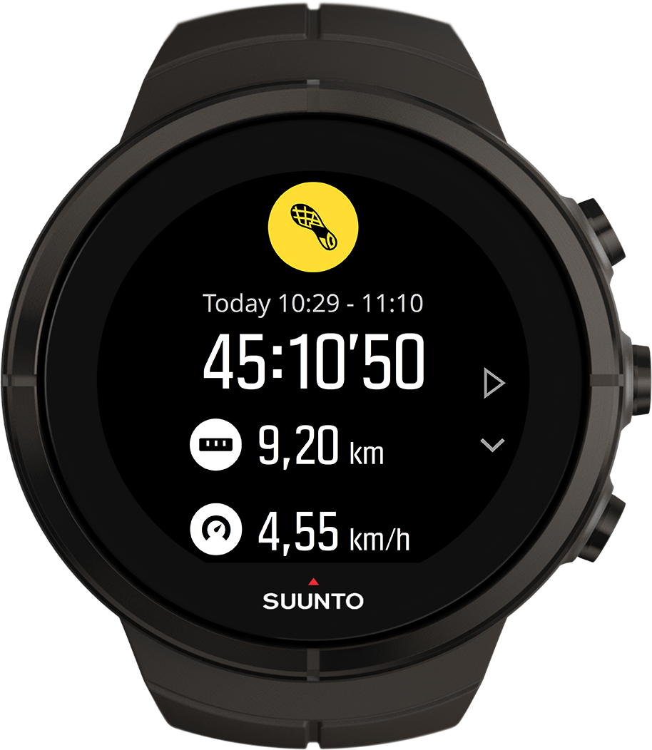
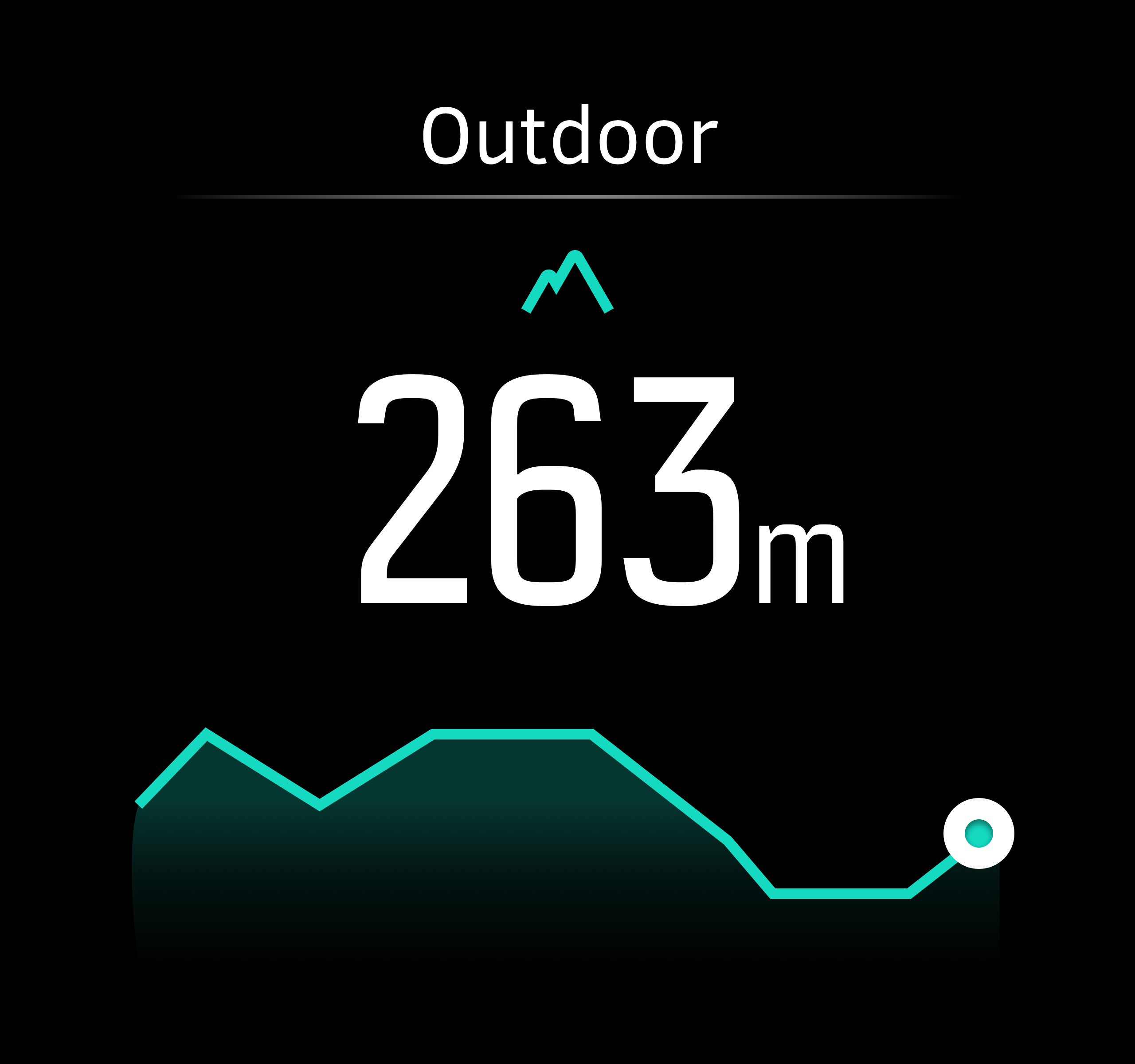
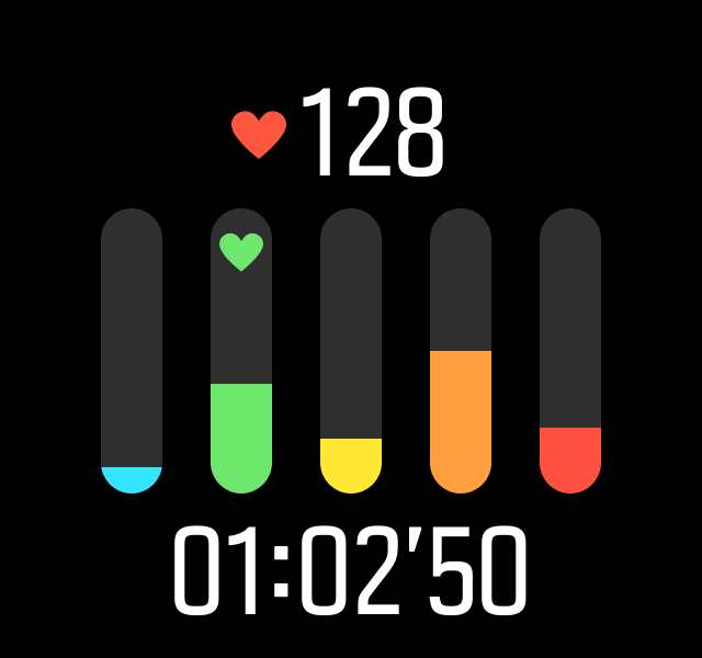
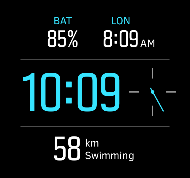
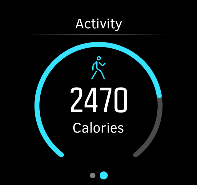
Small screen but lots of data
Accurate data points to fit in small interface for each sports modes targeted for specific sports enthusiast.
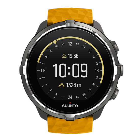
Color, high-resolution screen instead of B&W dot matrix
Color display was good to show clear hierarchy, but slowed the device down at times.
Worldwide audience: internationalization and localization
Text in some languages would not fit the interface. Different truncation strategies were designed.
Example: Navigational problem
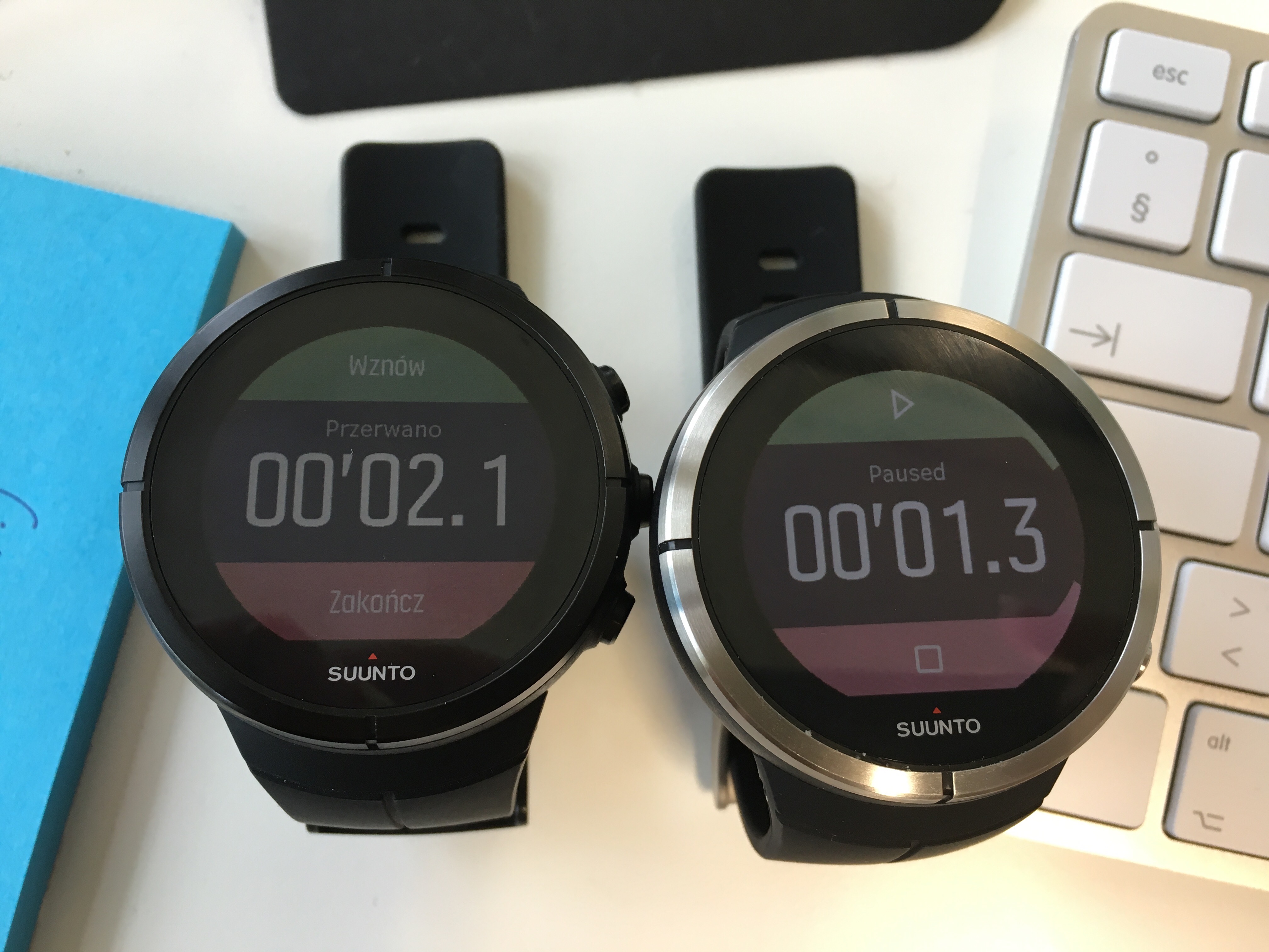
Below is an example of the common issues we faced while designing the watch UI and navigation. There are two ways to interact with the watch: using the touch screen and using the physical buttons. The watch is meant to be used in harsh conditions, such as water and in cold temperatures. Sometimes physical buttons are more convenient than the touch screen, especially while exercising.
As an example users did not understand the UI could also be controller with the physical buttons. The UI needs to guide the user to both, the correct touch surface on the screen and the correct physical button.
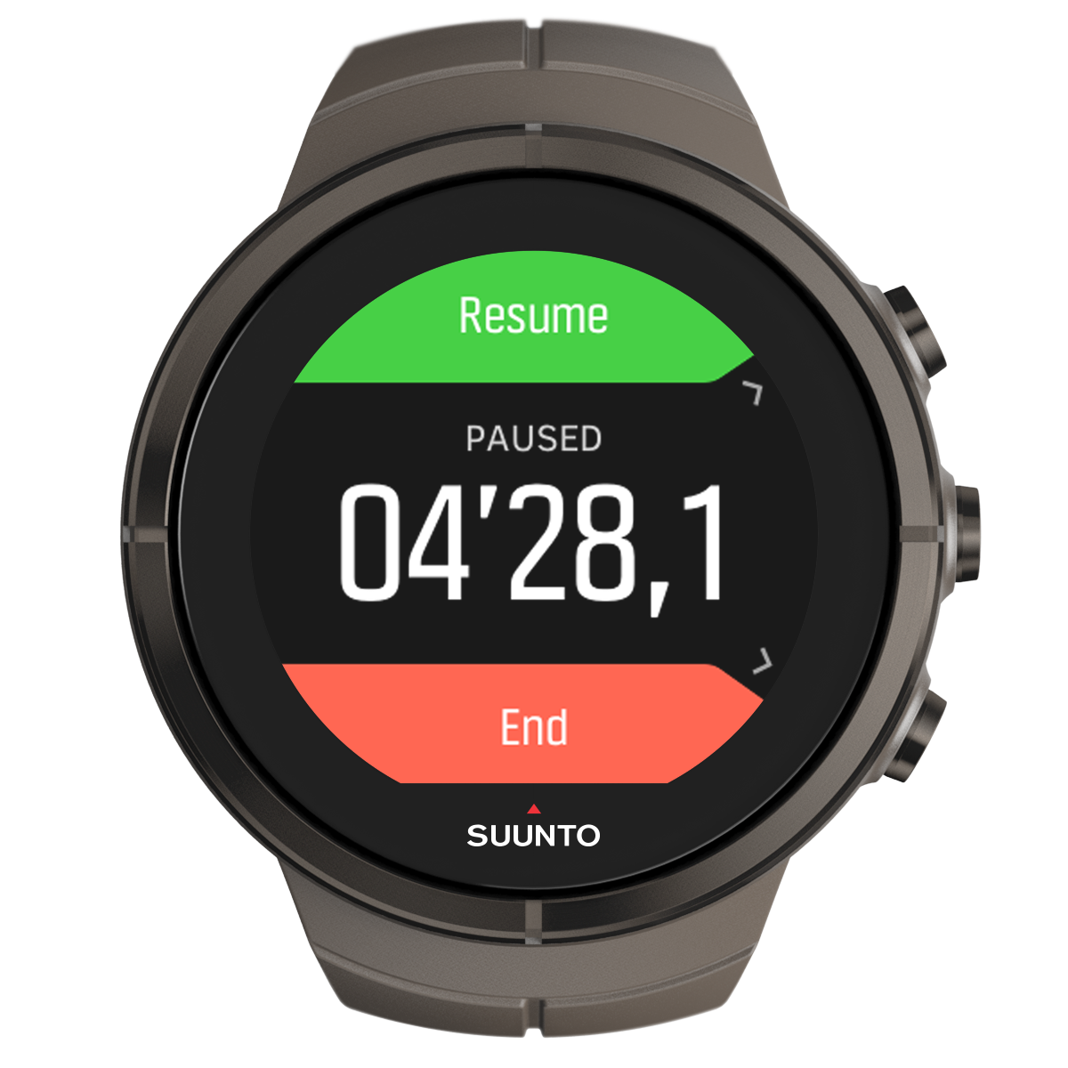
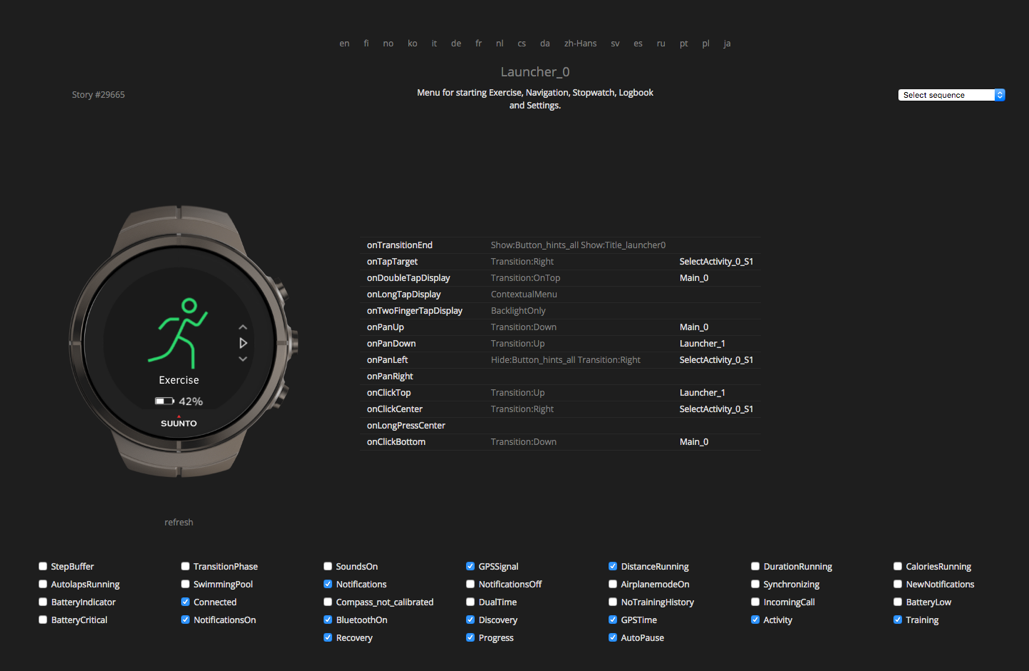
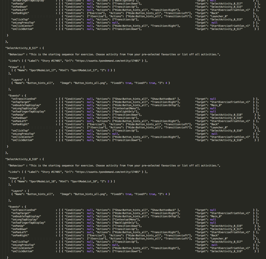
The final UI for exercise mode with navigation guidance
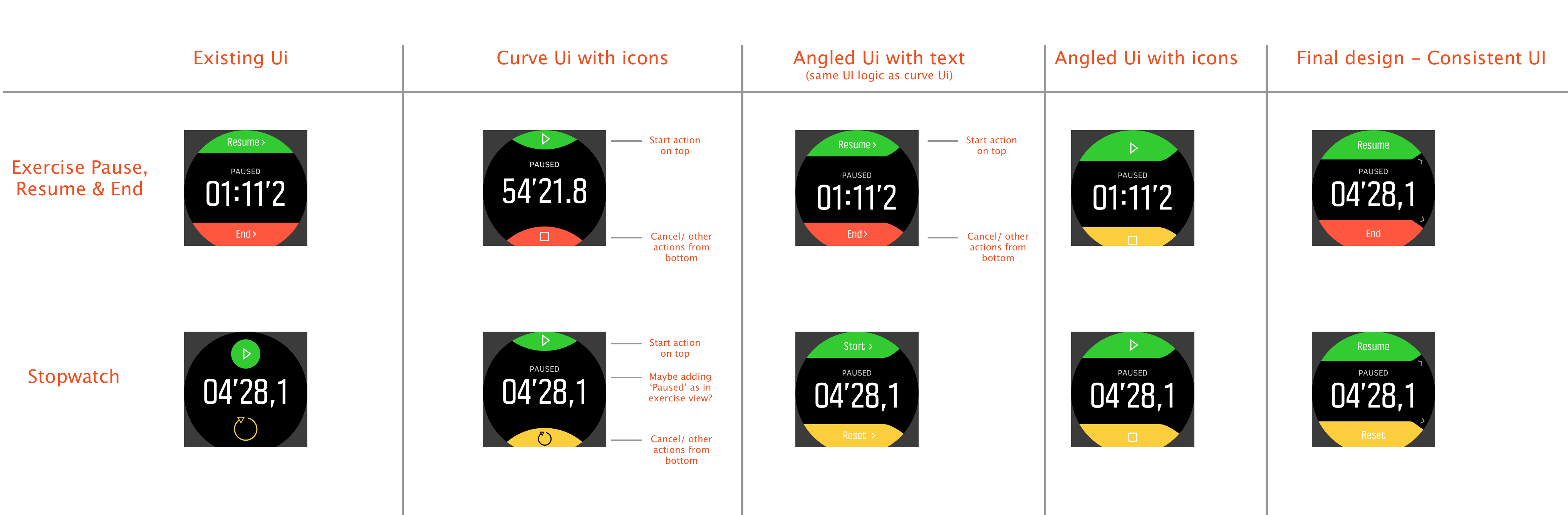
Chart of the screens and suggested a consistent ‘Close / End / Cancel button behaviors.
The iteration above shows variation in using text vs. icons. In the above example users were not able to understand that the ‘Resume’ and ‘End’ button in exercise mode could also be controlled through the press of the buttons. Adding a small arrow next to button and making the buttons angled and direct towards them, helped the users understand this logic.
At the same time we were evaluating which UI concept works best overall (current, curved or angled) and trying to achieve a consistent look and feel across similar screens in the product. The final design column shows the unified look and feel with two distinct features.
This was tested with internal users as the product wasn’t officially launched for public.
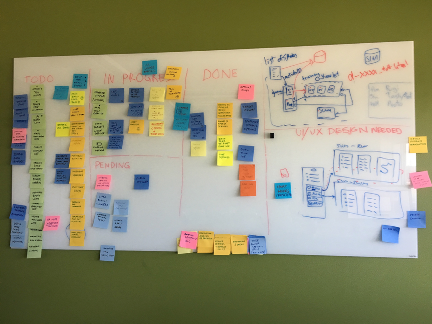
Agile design process
At Suunto the whole product organisation is designed around agile. The design and development teams have agile processes. This is how the agile process looks like from design teams point of view:
|
|
|
|
|
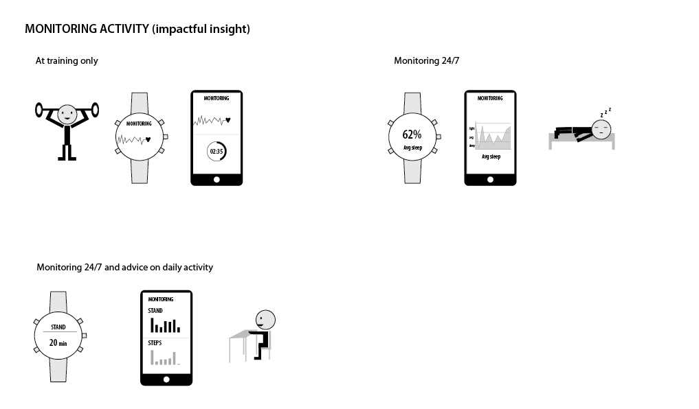
Scenarios
We conducted an internal user study to understand on what kind of features users would like to see in the watches. We wanted to incorporate some of these ideas to the Spartan Ultra. The following scnearios are a result of an internal questionnaire of most wanted fatures. They were used as a tool in the roadmapping phase.
UX design & user studies
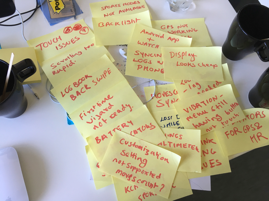
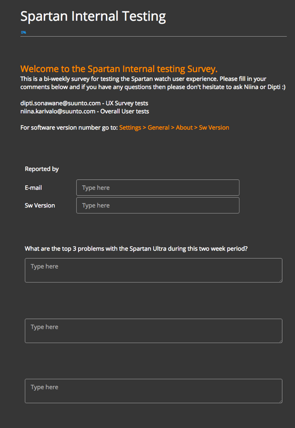
I conducted a bi-weekly online survey for Suunto to internally test the usability and interaction of the Spartan Ultra watch. This was done while the product was in development. The the survey questionnaire was to get an immediate feedback from the testers.Relevant design changes were made based on the results.
I also helped the team create similar survey to test the watch experience with the external testers.
Prototyping
Suunto had a elegant internal system to document and update the design changes on the watch UIs. I used HTML, CSS and basic Java Script to iterate the designs and test the UIs directly on the watch. The final changes were then updated by me to an internal demo tool. This system helped the developers, marketing team and the documentation team to keep up-to-date on the latest design changes that were made to the watch.
Result - an award-winning smart watch
The Suunto Spartan series was loved by the users. The new watch design was highly appraised in the sports community and the product won several international awards like the iF Design Award for Watches and Jewelry category. It was also rewarded with several "Best of show" and "Best new gear" awards from a number of publications.
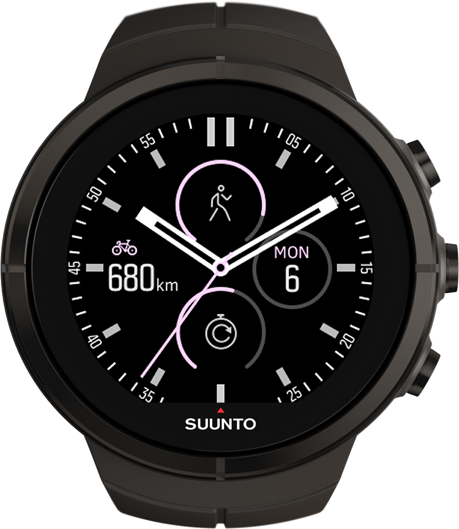
Ambit series
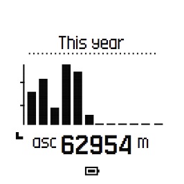
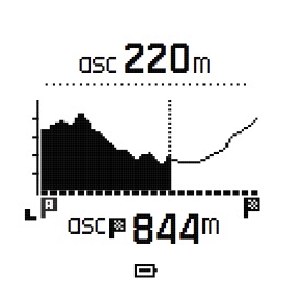
In addition to designing the Spartan watch I worked also on designsfor the Ambit product line. The Ambit family watches had a black and white display with no touch functionality. These were some of the legacy watches that were designed for specific groups of users based on their interest, such as adventure sports, outdoor and travel. I worked on wireframing and designing feature wise scenarios, pixel perfect UIs and icon designs, and maintaining the specifications across 4 product lines (Suunto Kailash, Travese, Vertical and Ambit 3)
Suunto Ambit Peak
Suunto Ambit Sport
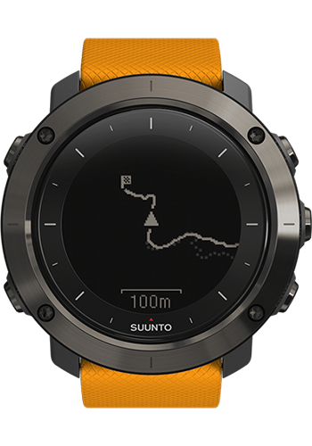
Suunto Traverse
Suunto Vertical